Executive Summary
An outside agency created Neurotone's brand package and then handed it off completely. Since then, the brand has been mine to run. I apply it everywhere marketing shows up, and I've evolved it: a livelier color palette, typography rules built into the design system, templates for decks and emails, and new landing pages for each product.
When Neurotone launched its second product, Tinnitus Pro, I created its brand and every piece of launch creative, from the email campaign to the landing page. At Neurotone, product and brand are one job, and the brand half is substantial.
3
Brands under one system: Neurotone AI, Lace AI Pro, and Tinnitus Pro
1,982
Partner clinics on the Tinnitus Pro launch email
27.5%
Launch email open rate, with bots filtered out
Evolving the Brand After the Handoff
The agency's package was a strong foundation, but it was stark. As the company grew, the brand needed to cover more ground than the original guidelines anticipated, so I took over the guidelines and extended them:
- Color. I added colors and gradients to bring more life into a palette that had felt cold.
- Typography. I refined the type and wrote the rules into the design system, so the product and marketing use the same hierarchy.
- Templates. I built templates for sales decks, event decks, and emails, so new material starts on-brand instead of from scratch.
- Web. I designed new landing pages for each major product and refined the site overall.
Launching Tinnitus Pro
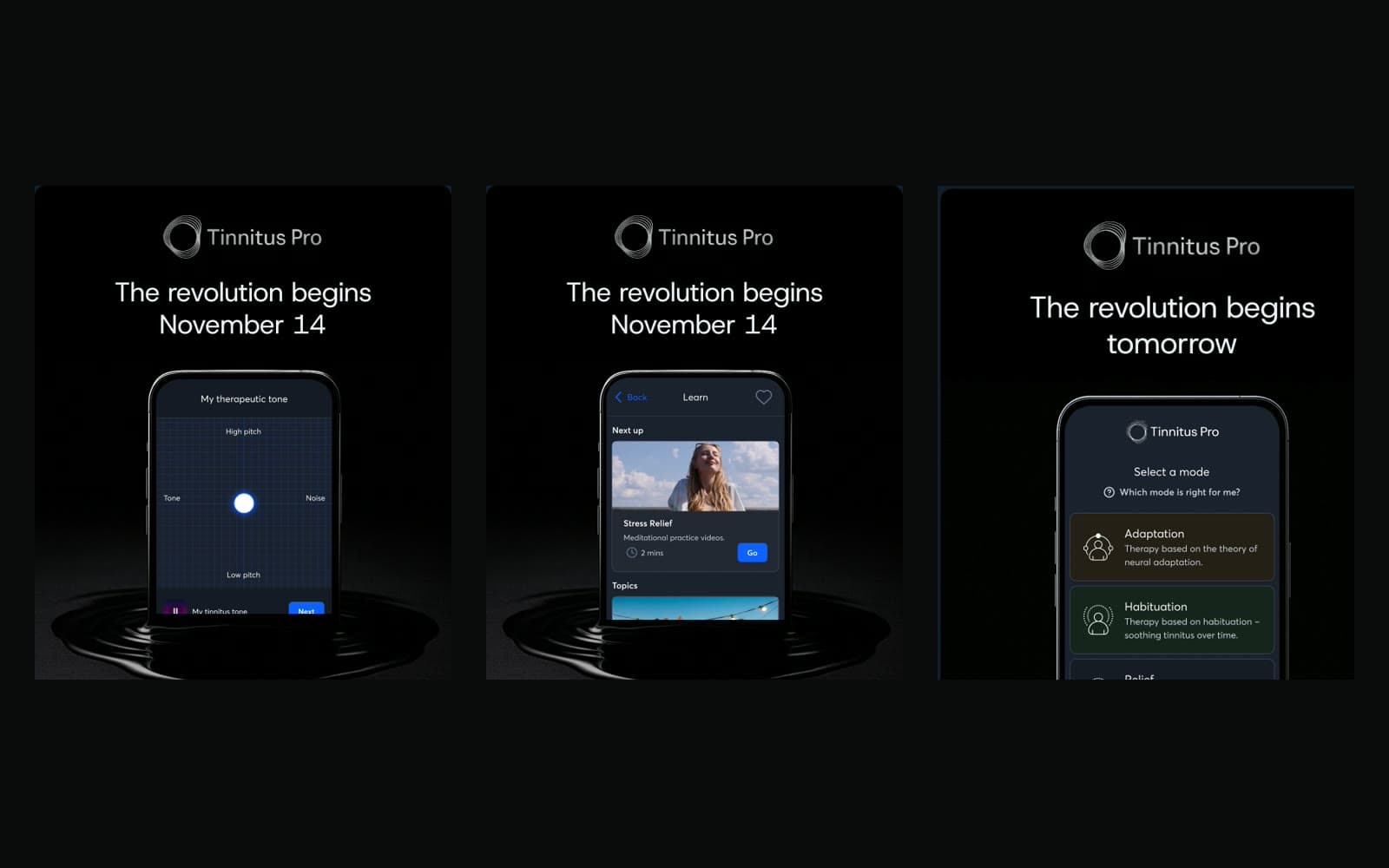
Tinnitus Pro was a new product for a new audience, and its brand was mine from the start. The launch concept was the app rising out of a dark pool of water. It says that something new is coming to life, and it mirrors the patient's journey: people with bothersome tinnitus are often in a dark place, and the product is about bringing them out of it.
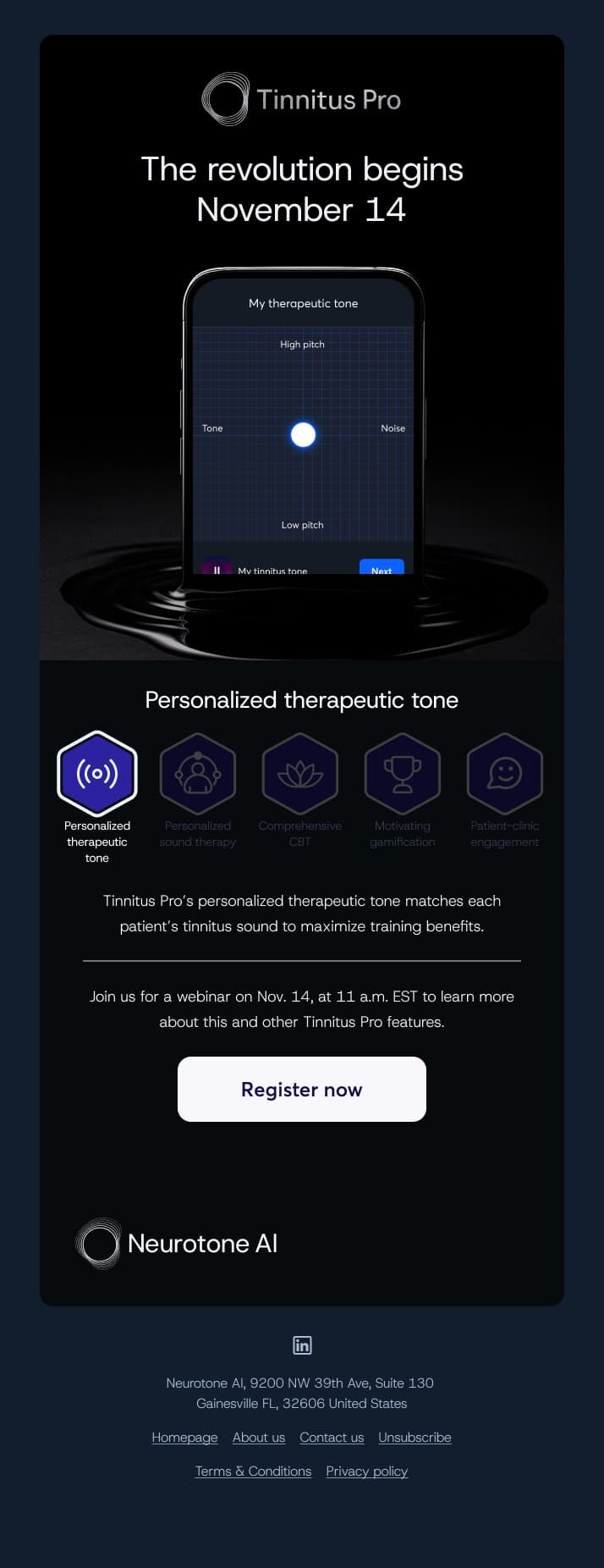
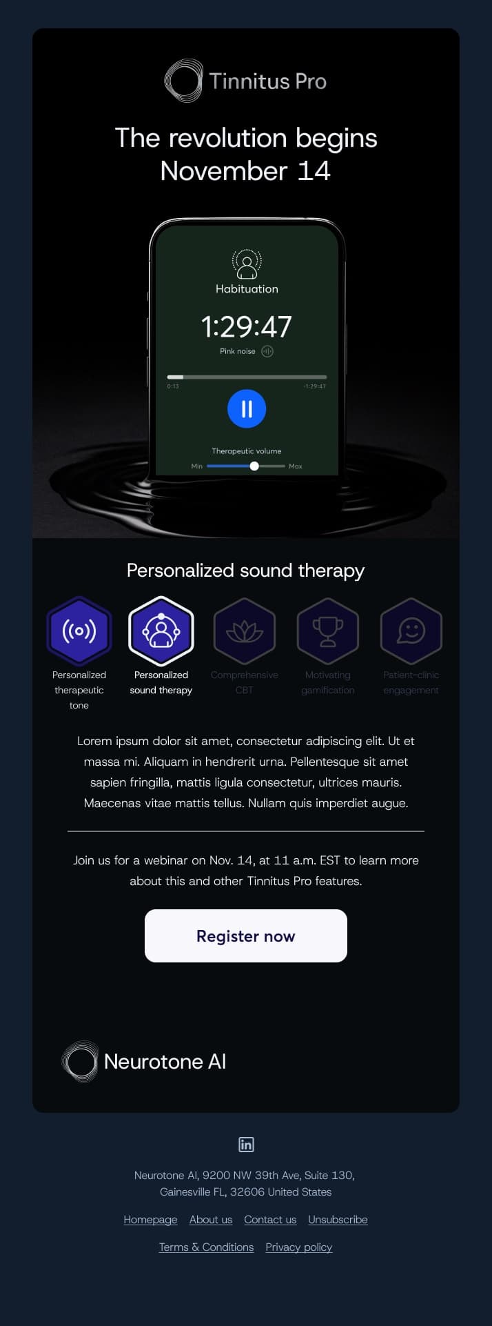
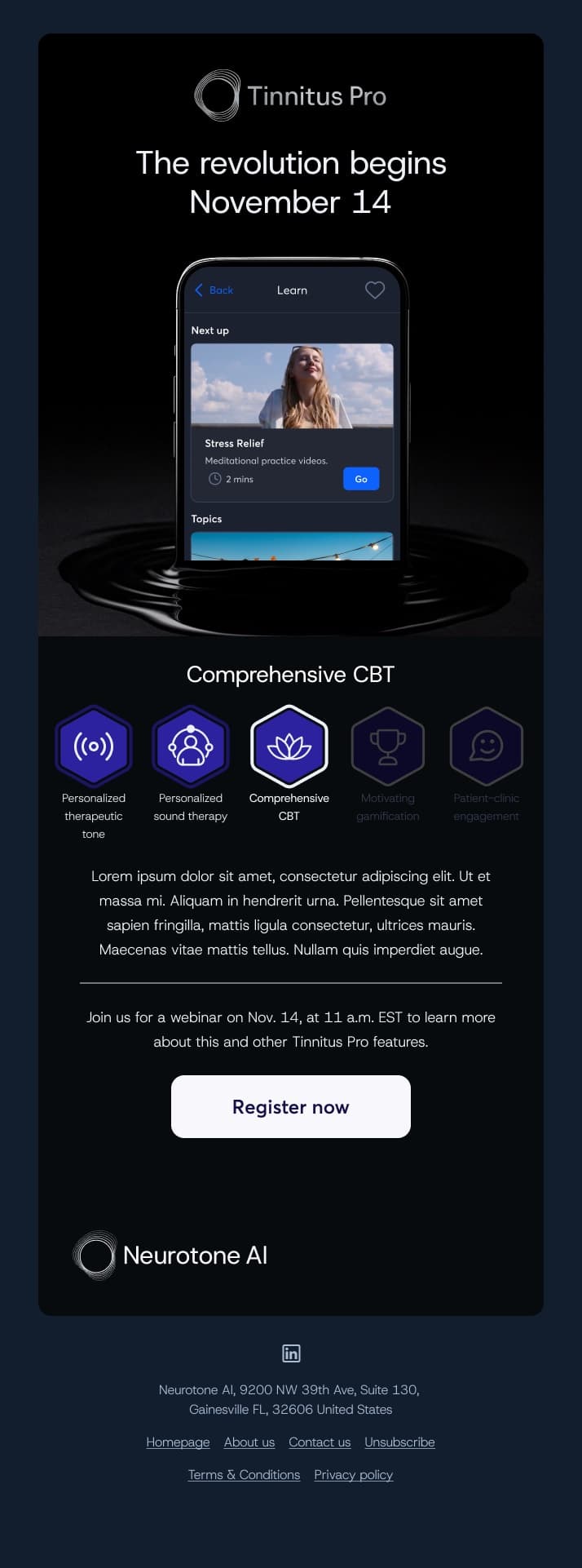
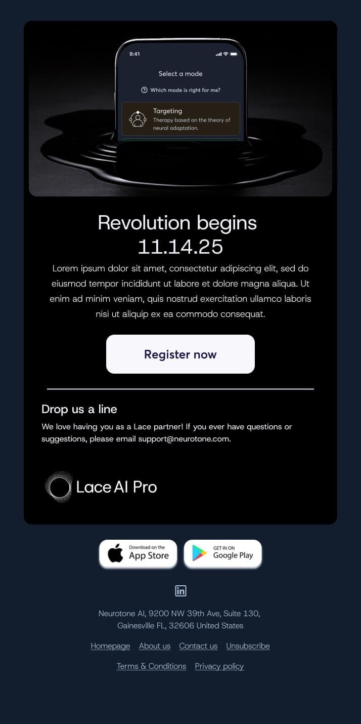
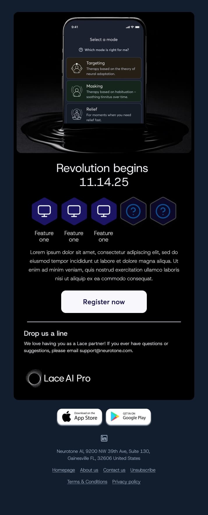
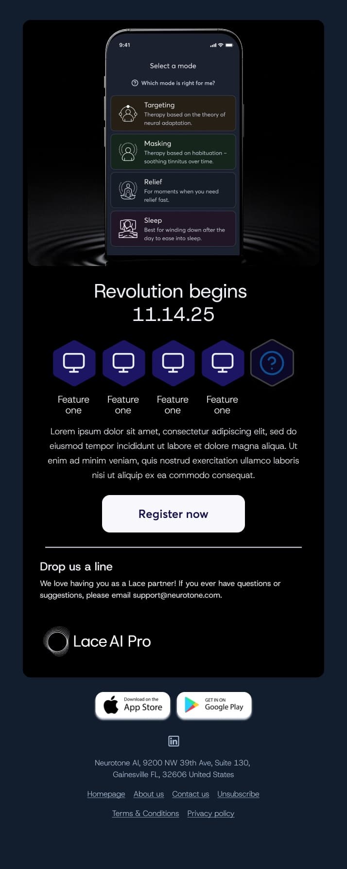
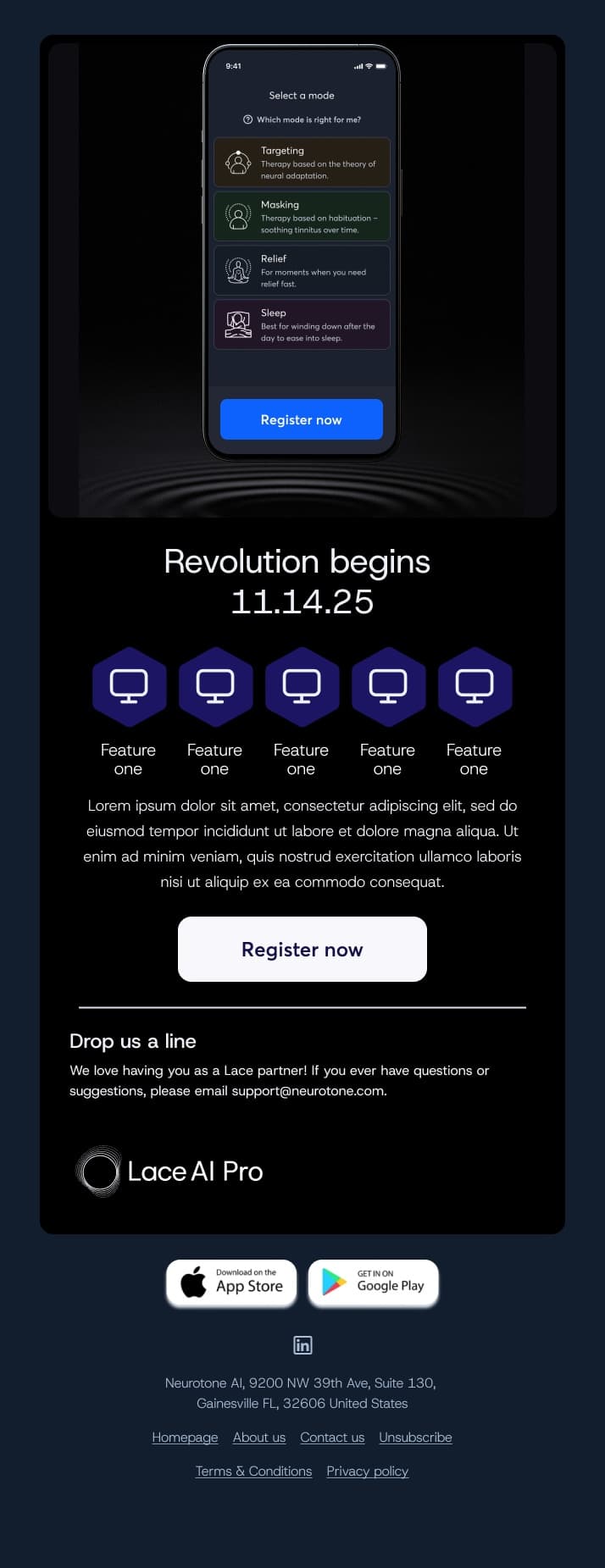
The campaign was a countdown to the November 14 launch. Each email introduced one of the five core features by lighting up its hexagon in a row, building toward a final email where all five were lit. The countdown emails are shown here as design comps; the final launch email follows below.
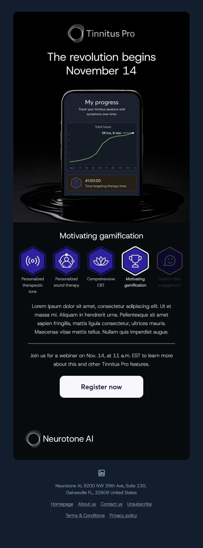
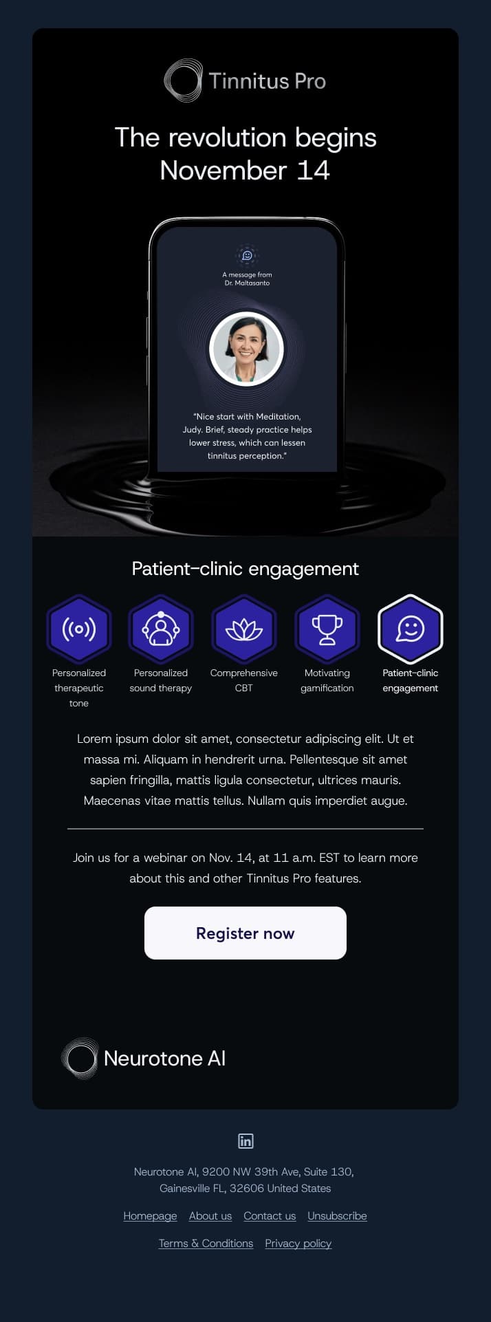
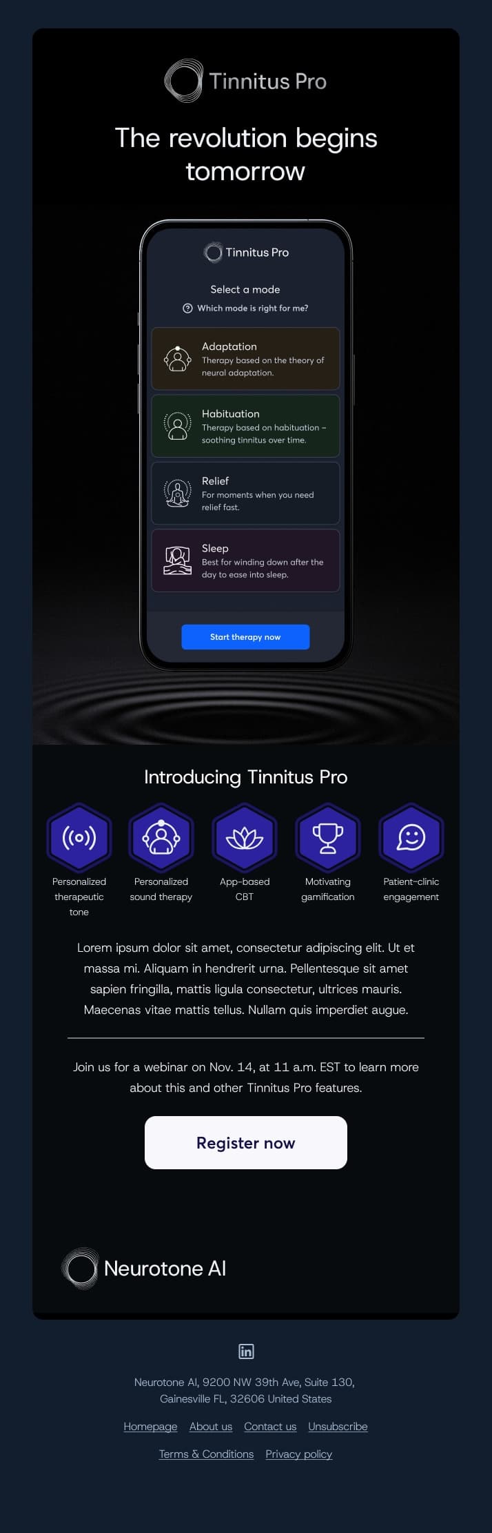
The launch email itself switched from teasing to telling: the product is available, here's the launch offer, here's where partners find it in the Pro Portal, and here are all five features explained in a sentence each.
The launch email opened on an animated header: the Tinnitus Pro home screen rising out of the same dark pool, cycling through the tone finder, sound therapy, meditation, and home screens.
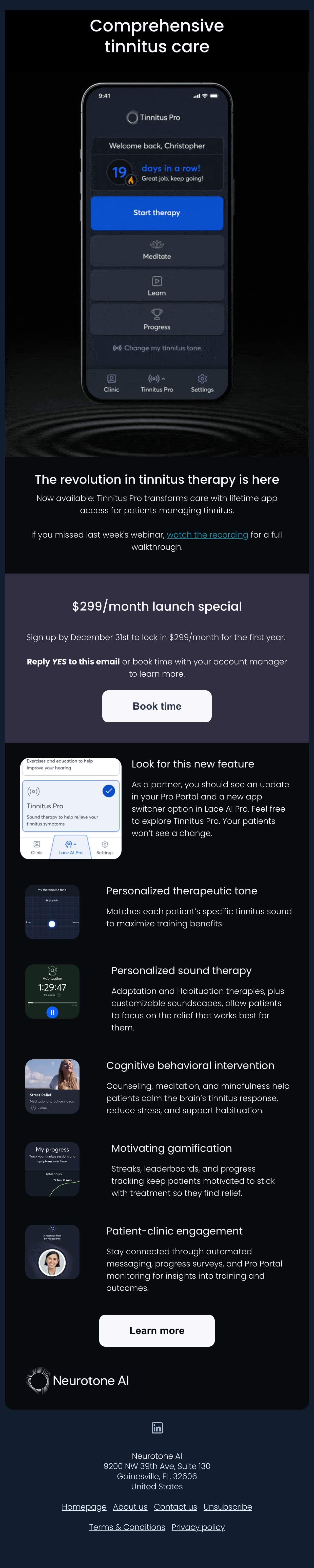
The same concept ran through the Lace AI Pro partner emails, where the phone reveals more of the app and the feature hexagons fill in with each send. These drafts show how the series took shape before the final copy went in.
Landing Pages
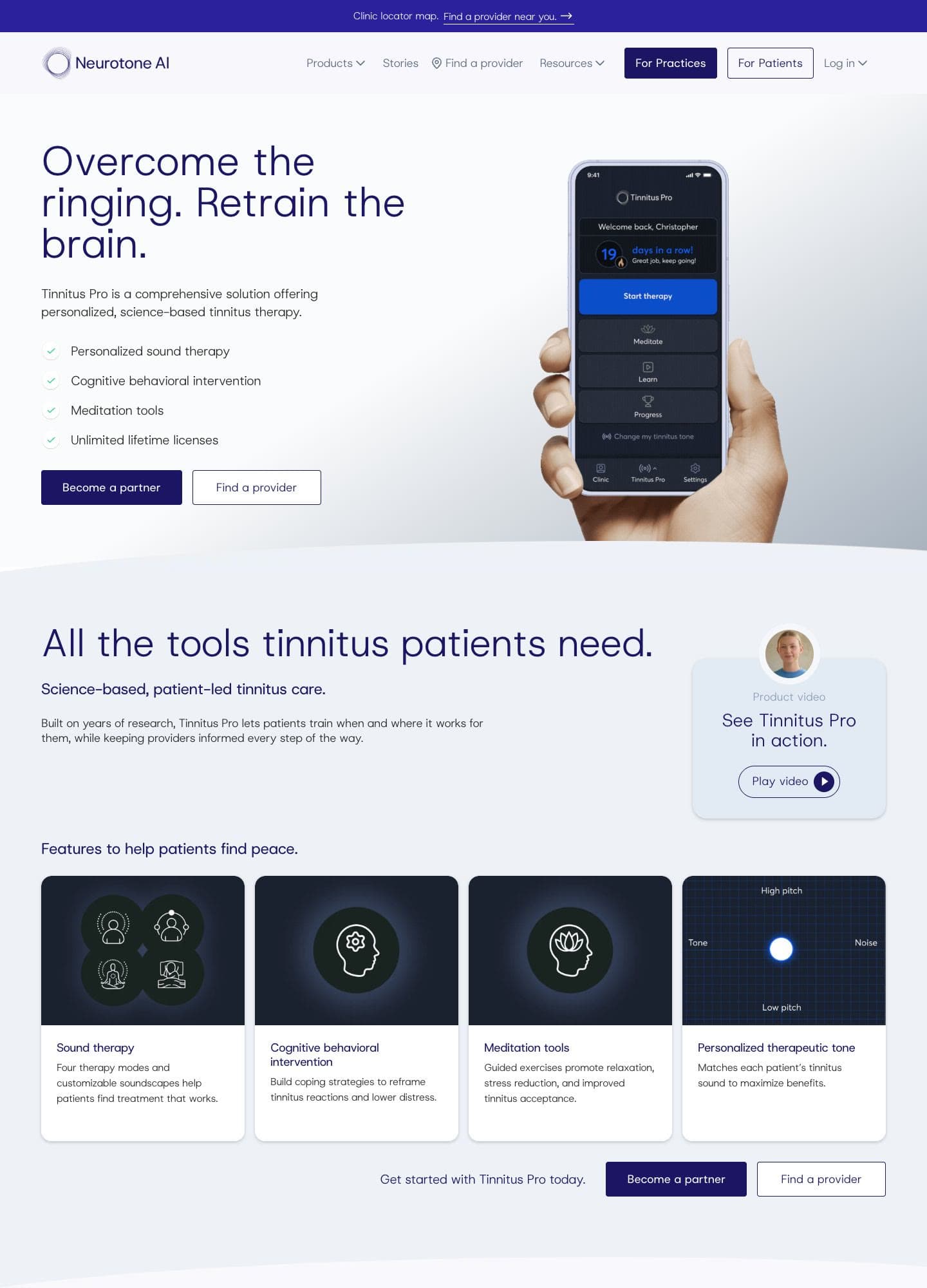
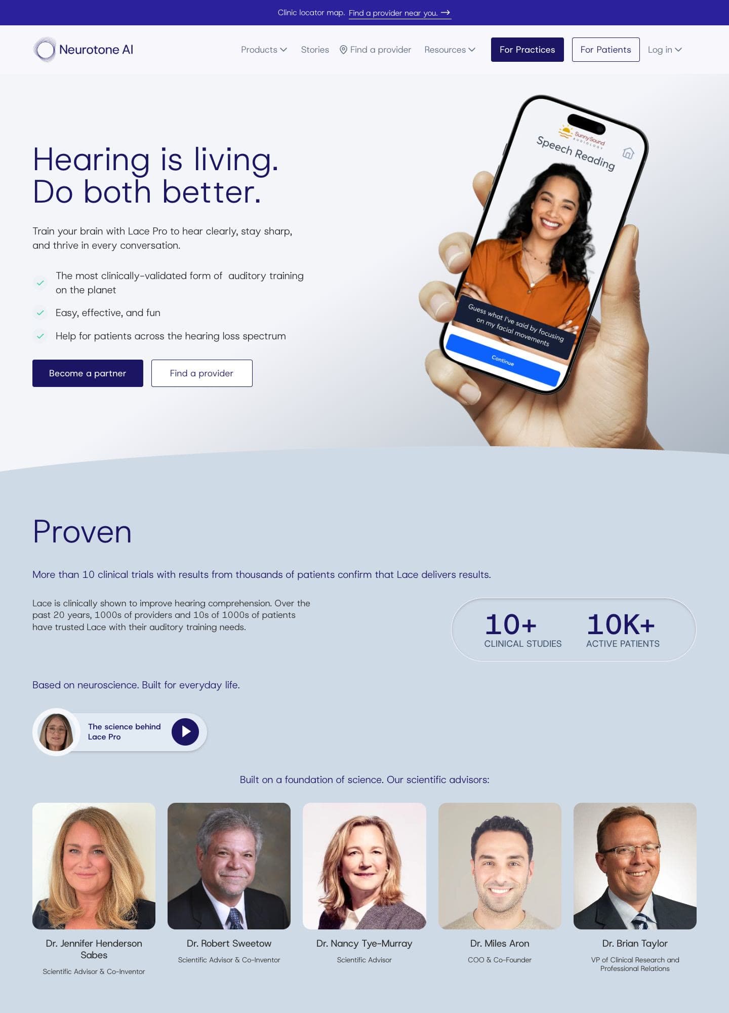
I designed new landing pages for both products. They share a structure: a one-line promise up top, the two calls to action that matter (become a partner, find a provider), real product screens, and a feature grid. Tinnitus Pro carries the darker palette from its launch campaign, so email, web, and app read as one system.
The Video Mailer
To reach prospective clinics, I designed a direct mail piece with a video screen built into the card. I designed all of it: the box, the letter from our scientific advisor Dr. Robert Sweetow, the card, and the video it plays. A clinic owner opens the box, reads the letter, and opens the card to see Dr. Sweetow introduce Lace AI Pro, followed by clinicians talking about what it did for their practices. The back of the card has a QR code to book a demo.
The video on the card, with sound:
Results
The launch email for Tinnitus Pro went to 1,982 partner clinics. With bots filtered out, 27.5% opened it and 7.2% of those who opened clicked through. That's a healthy open rate for a B2B audience, with a click rate in the typical range.
We didn't track the mailer with numbers, but clinics responded well to it.
What It Taught Me
Owning brand and product together makes both better. The launch emails used real app screens because I designed the app. The landing pages match the product because the same person set the type rules for both. When one designer holds the whole system, a clinic sees one company from the first mailer to the first patient session.